Gauge
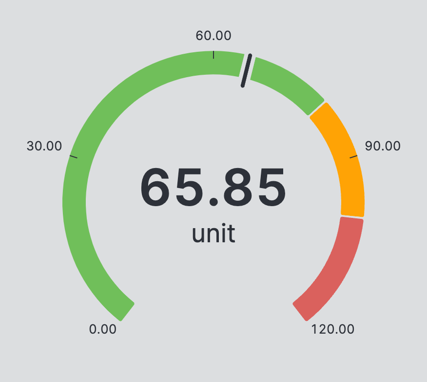
A Gauge is used to display values that change frequently and is visualized as a dial. It also alerts operators about critical ranges that the value may fall into.
Properties
General
The data source for this gauge. Should be a numeric Data Variable. Use the
Ranges property of this variable to visualize sections.
Ticks
Control the number of ticks that the gauge will display.
Container
This icon will be displayed next to the element's label on pages that support it, like the Dashboard Page. An Element can make use of the icon to:
- Provide more context to add meaning
- Improve recognition and discoverability, especially on larger pages
Apply Status
From Value with Ranges
Use this option, if the variable linked to Value provides status information. This will allow you to automatically apply the status from Value to indicate the quality of the value as either Good, Warning, Critical or Accent.
Learn more with the following resources:
Manually
Display Condition
true or false you're good to go.